Bullet Diary is a minimalistic, yet practical journaling iOS mobile application designed to provide a pleasant and effortless experience for writing journal entries. Each entry is composed of up to three bullet points that encapsulate key highlights of the day.
The three, fun-sized bullet constraint entails the writer to focus on the most meaningful events, rather than logging mundane details of everyday life. Doing so will eliminate the pain of writing lengthy entries, and remove the pressure to devote a significant amount of time. Users are able to review their past entries with ease with three different view modes.
I have always wanted a simple journaling application without the hassle all the fancy features. I knew that I wouldn't write lengthy entries every day via a mobile medium - I wanted an application that would allow me to recap the most memorable highlights of a day, and to provide a quick overview of my past entries. Though dozens of journaling app exist in the iOS App Store right now, I couldn't find the application that would fit my needs.
So I decided to make one myself.
Take a look at the finished product in the app store, and my processes below!

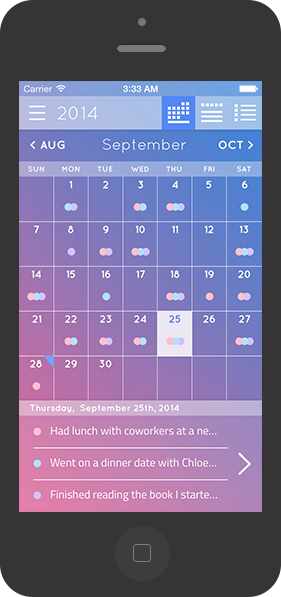
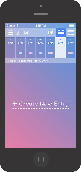
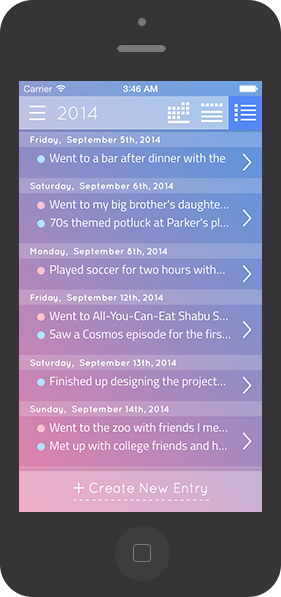
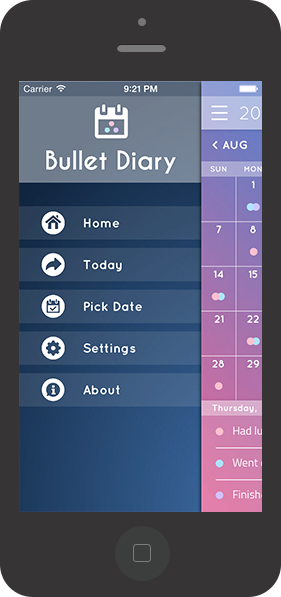
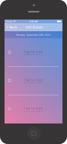
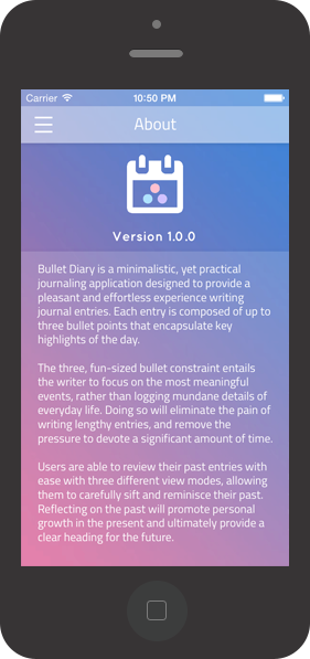
After inception of the idea, I then had to flesh out the details (fancy term: Systems and Requirements Analysis) and pinpoint the crucial features that would make the app a success. Since I was the direct end user, I had to engage in some soul-searching to find out what I really wanted. I took inspiration from Twitter's model: "small burst of information called Tweets... 140 characters long." I decided that entries would be encapsulated in bullet points, with a fixed character length. I hoped the contraints imposed would reframe the task of writing daily entries from a chore to a quick and fun process.
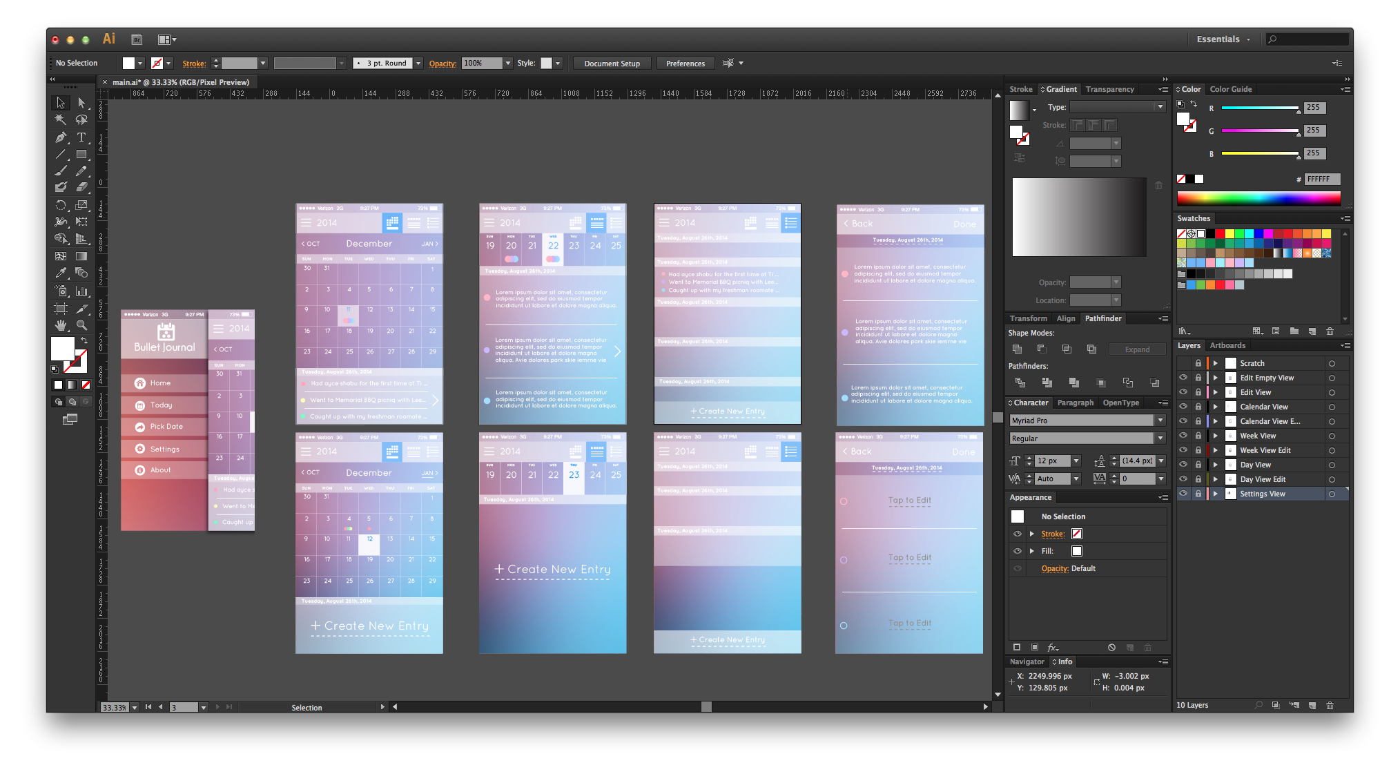
I created a low fidelity design in my sketchbook, and I opened my favorite tool, Adobe Illustrator to design a high fidelity design and wireframe. I wanted the overall look and feel to be minimalistic, augmented with a 'light and airy' feel to it. I chose white as my main color, with varying degree of opacity and subtle shadows to create a sense of variety and depth. I decided to go with blue as my secondary color.
I've always loved the Quicksand font and wanted to do a project with it. The round edges and 'clean' feel of Quicksand proved to be an apt choice. I searched for a secondary font that would harmonize well with Quicksand and to provide contrast between the user created text and the application texts. Though I considered a serif font to provide a higher contrast, I opted to go with a sans-serif font, Titillium, to achieve better unity and harmony, while sacrificing the serif contrast.
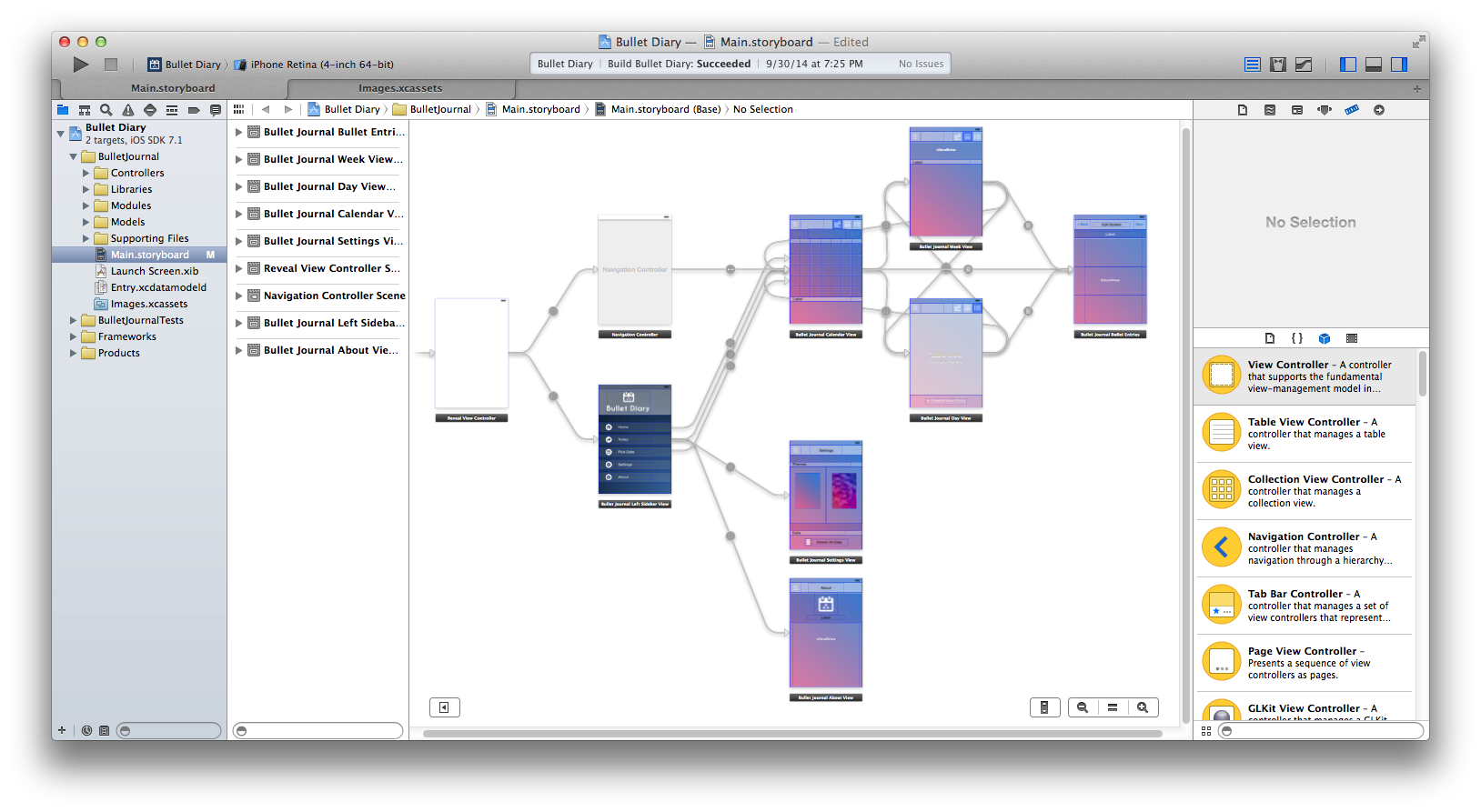
The next step, Systems Design would parallel the UI/UX design. I feel this is the step where the actual term 'Software Engineering' comes into play. Thankfully, mobile application is smaller in scope when compared to web applications (especially this app) - I mapped out the entire architecture (quite a grandiose term) with relative ease. The design closely follows the textbook definition of MVC (Model-View-Controller) with an added service layer.
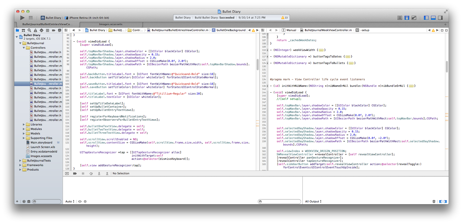
Given that the previous steps are done well, coding is the easiest part of the whole process. The steps are pretty clear when the goals precisely defined. Though there were few parts of the application that were tricky to implement (i.e. infinite scroll for dates), the coding of the application was complete after careful abstraction and deconstruction into managable chunks.
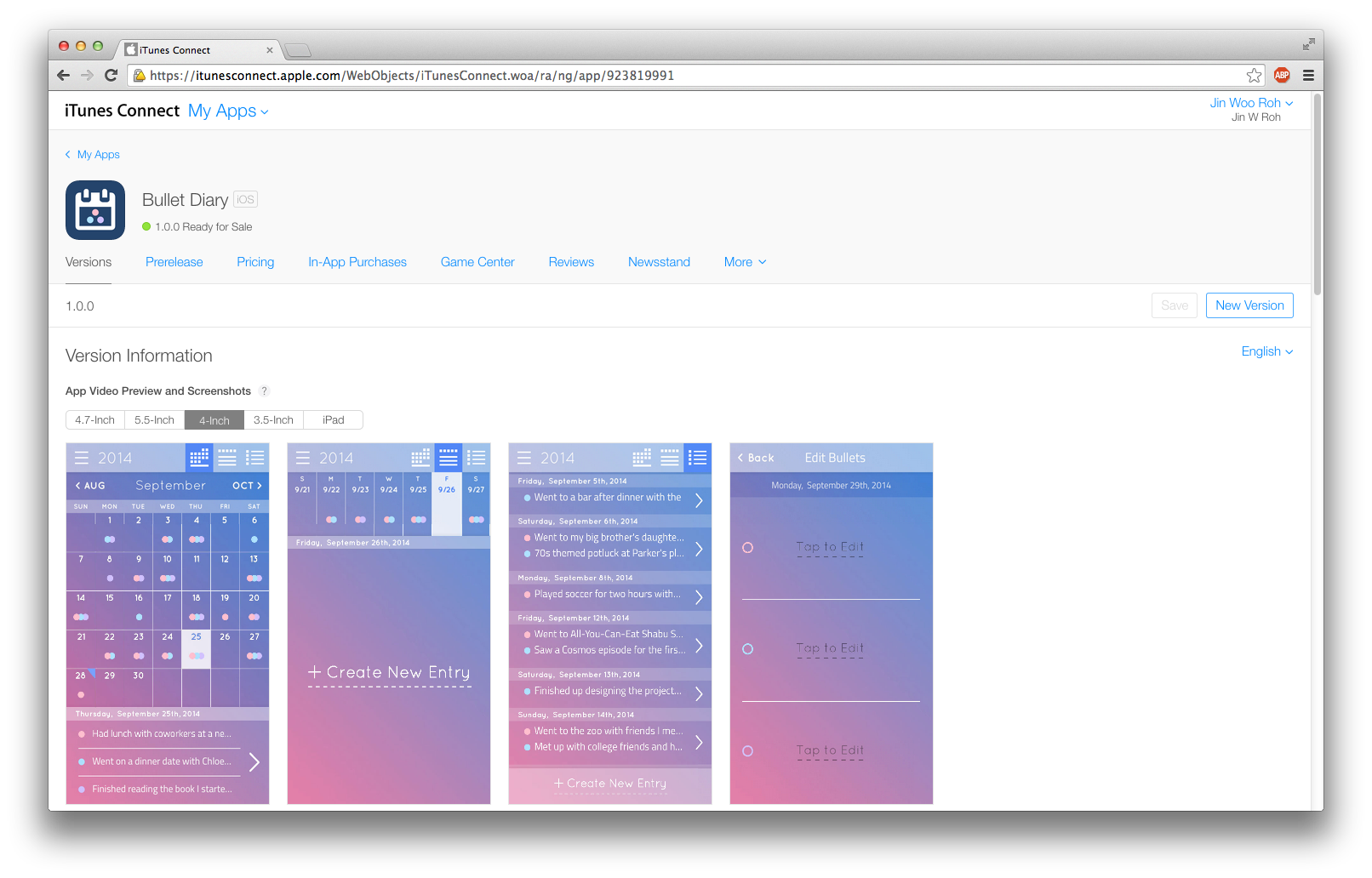
After testing for considerable amount of time, the application was finally ready for production. I thought submitting the application to the iOS app store and waiting for the review process to complete was the hardest part. After countless days (13 days to be exact) of spamming F5 key to refresh, the status indicator in my app dashboard finally turned to green with the much anticipated status - "Ready for Sale".

